
LOCAL COLOR
Martha Clippinger, Ash Ferlito, Stacy Fisher
Kaitlin Zorah McDonough, Ilse Sørensen Murdock, Maria Stabio
May 16 - June 13
Text by Ilse Sørensen Murdock
Kristen Lorello is pleased to present Local Color, a show featuring works by six women artists: Martha Clippinger, Ash Ferlito, Stacy Fisher, Kaitlin Zorah McDonough, Ilse Sørensen Murdock, and Maria Stabio. Over the last five years, these artists, also known as Color Group, have convened monthly to read, discuss, and expand their understanding of color. Through study and conversation, they work through canonical texts such as Wittgenstein's Remarks on Color and Goethe’s Theory of Colours, as well as contemporary works from thinkers such as Julia Kristeva, Maggie Nelson, Bridget Riley, David Batchelor, and Elaine Scarry.
In painting terminology, “local color” refers to the color assigned to a thing; a lemon is yellow and the sky is blue. It is the color a thing is as you think of it, unaffected by light, shadow, or reflection. Yet anyone who has studied color from observation knows that a Red Delicious apple may be dark purple in a dimly lit room, may appear orange in a warm sunrise, or might appear pink when highly lit. Additionally, many painters describe color not only as a property “on” objects but as a relational event between the eye, light, surrounding colors, and memory.
However, “local color” also operates beyond being an art term or idea in the mind; it is an interplay of ideas and societal norms. In Elaine Scarry's lecture, Imagining Color: Color Threads in Proust and Murasaki, she explores the intimate relationship between the retina and the brain, and presents the idea of color as being projected outward, not just seen. Scarry suggests that color is not merely a passive reception of external reality, but something actively produced by perception and imagination. Through examples in literature, especially in the works of Marcel Proust, she explores how imagined color can feel sensorially real, almost as vivid as direct observation.
Color, as discussed by David Batchelor in Chromophobia, is culturally loaded and, he argues, has been used historically to reinforce social and cultural hierarchies. While color is a deeply participatory perceptual phenomenon, tied to imagination and attention, it is also strongly shaped by subjective experiences like the wallpaper or dinnerware of the family home, the light or lack thereof in a certain geography, the tastes and fashions of a time period or culture, and the signifiers of gender identity or politics, to name a few.
Color impacts our everyday lives, including how we orient ourselves within the astounding pleasures of the visual world, as well as how we connect to shared reality. Color investigations for the artists in Color Group form a shared backdrop, while each artist approaches and unearths aspects of color in their own distinct way. Color for this group is a passion and fascination; a local discovery and a universe of inquiry.
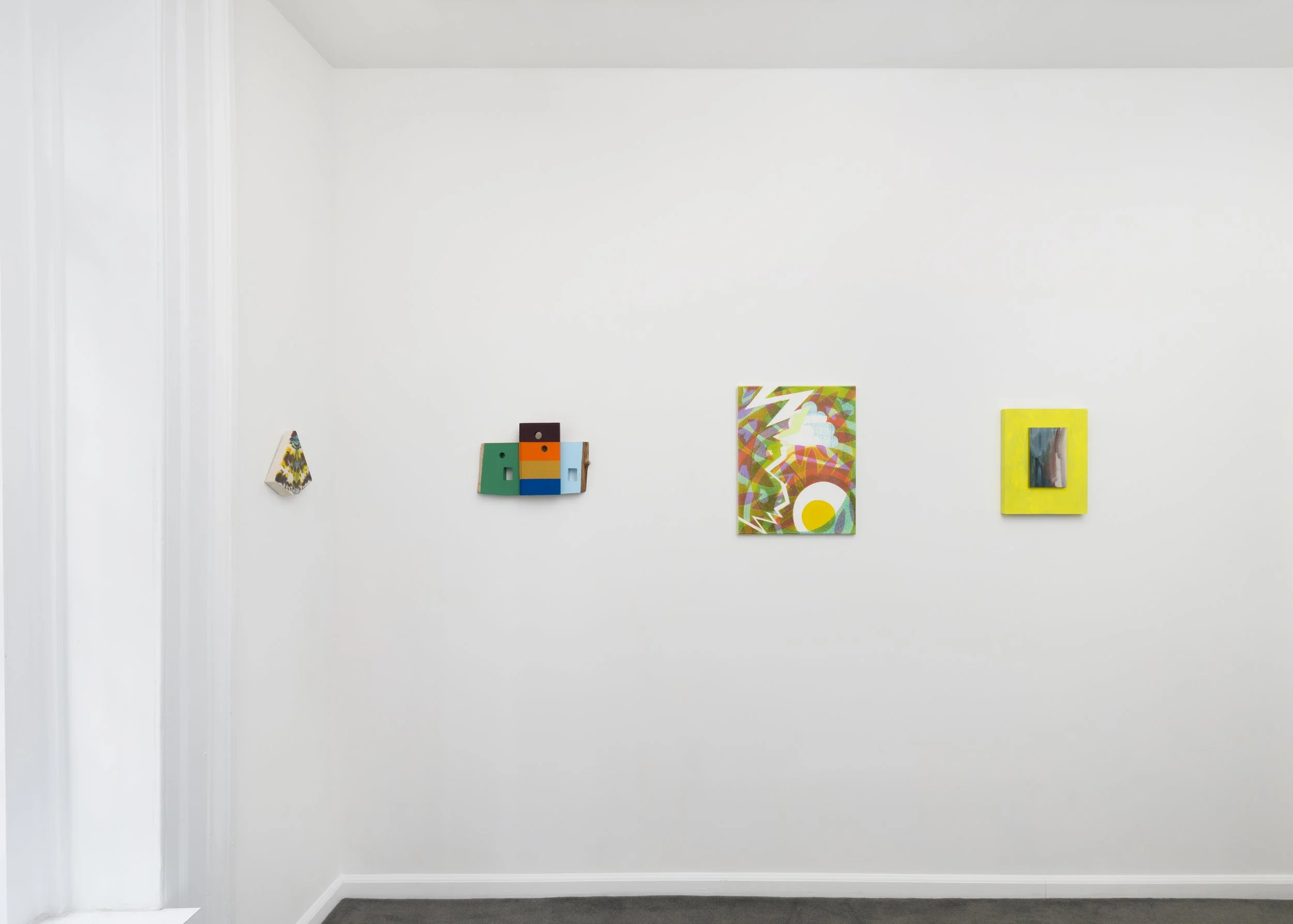
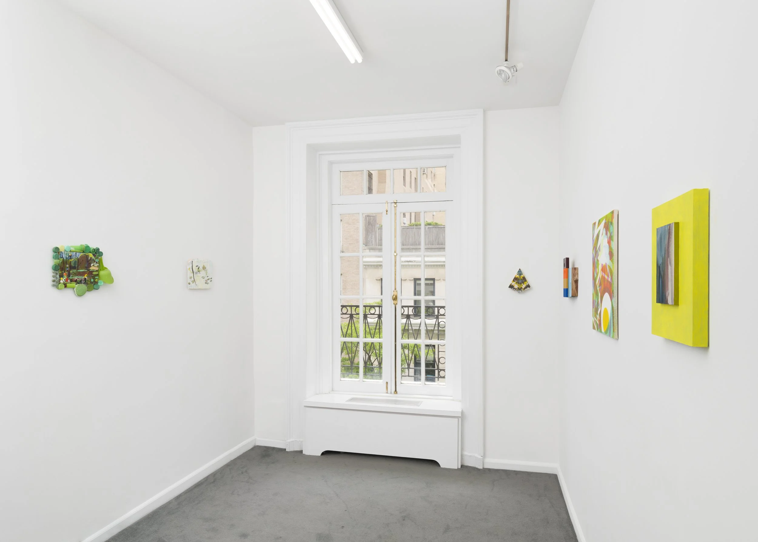
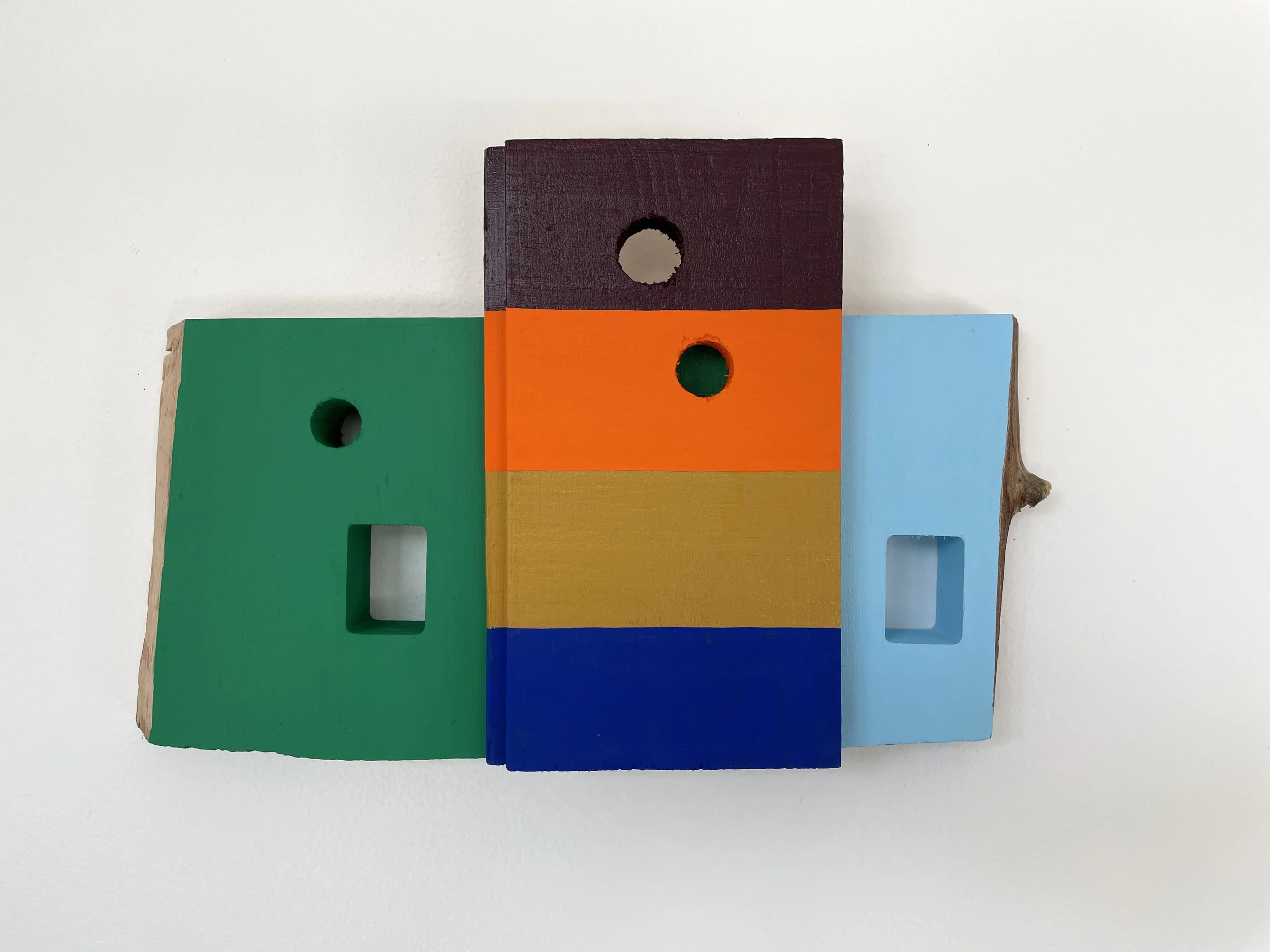
Martha Clippinger’s abstract wood constructions are made with reclaimed materials and emphasize off-kilter geometries and irregular symmetries. Her work presents a range of surface texture, vibrant stacked colors, and contrasting exposed wood edges. Her painted constructions are modest in scale, but the bold color compositions occupy a space beyond their physical dimensions. Through cutouts and windows, her work reflects an interest in vernacular architecture, where intention and happenstance coexist.
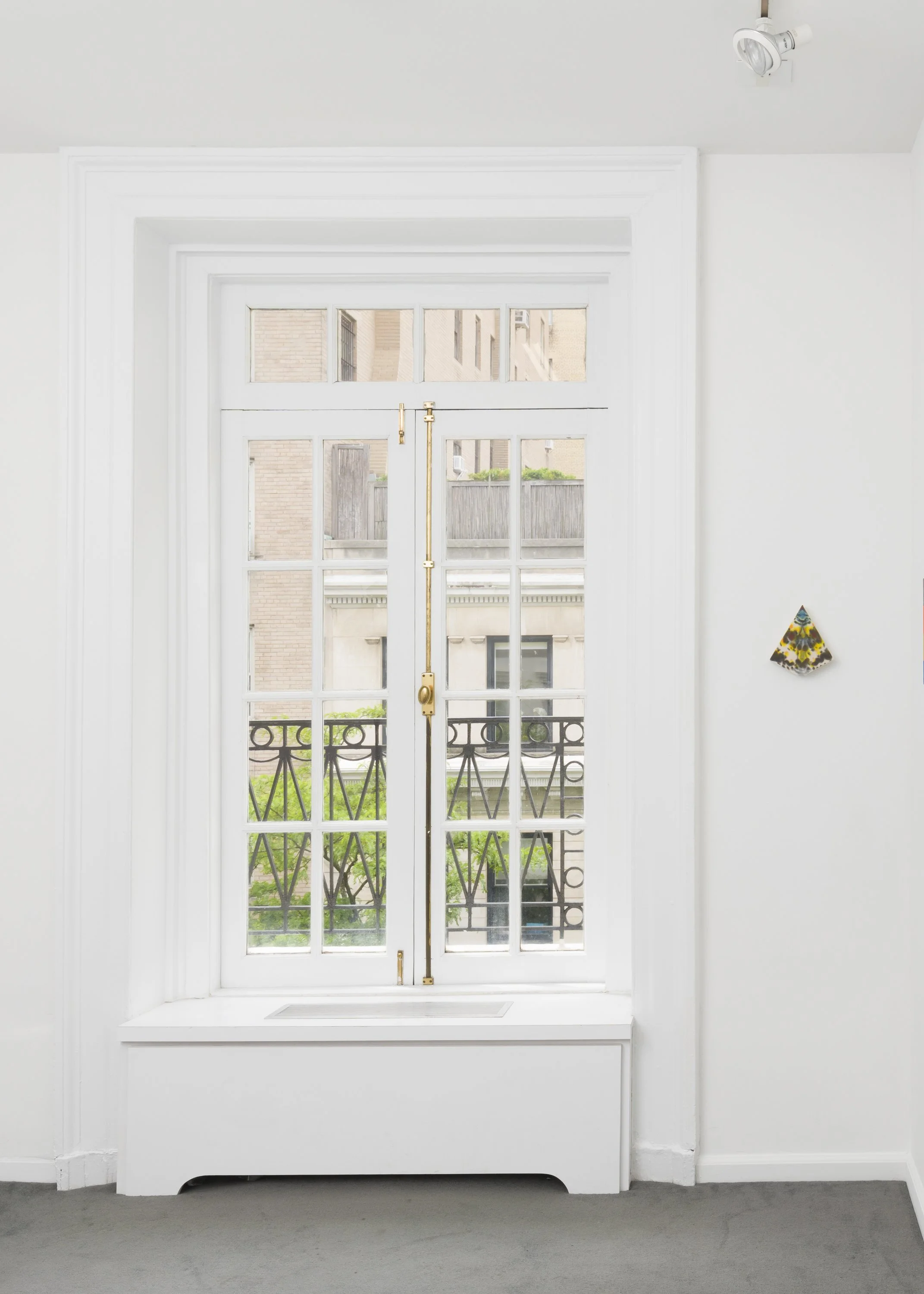
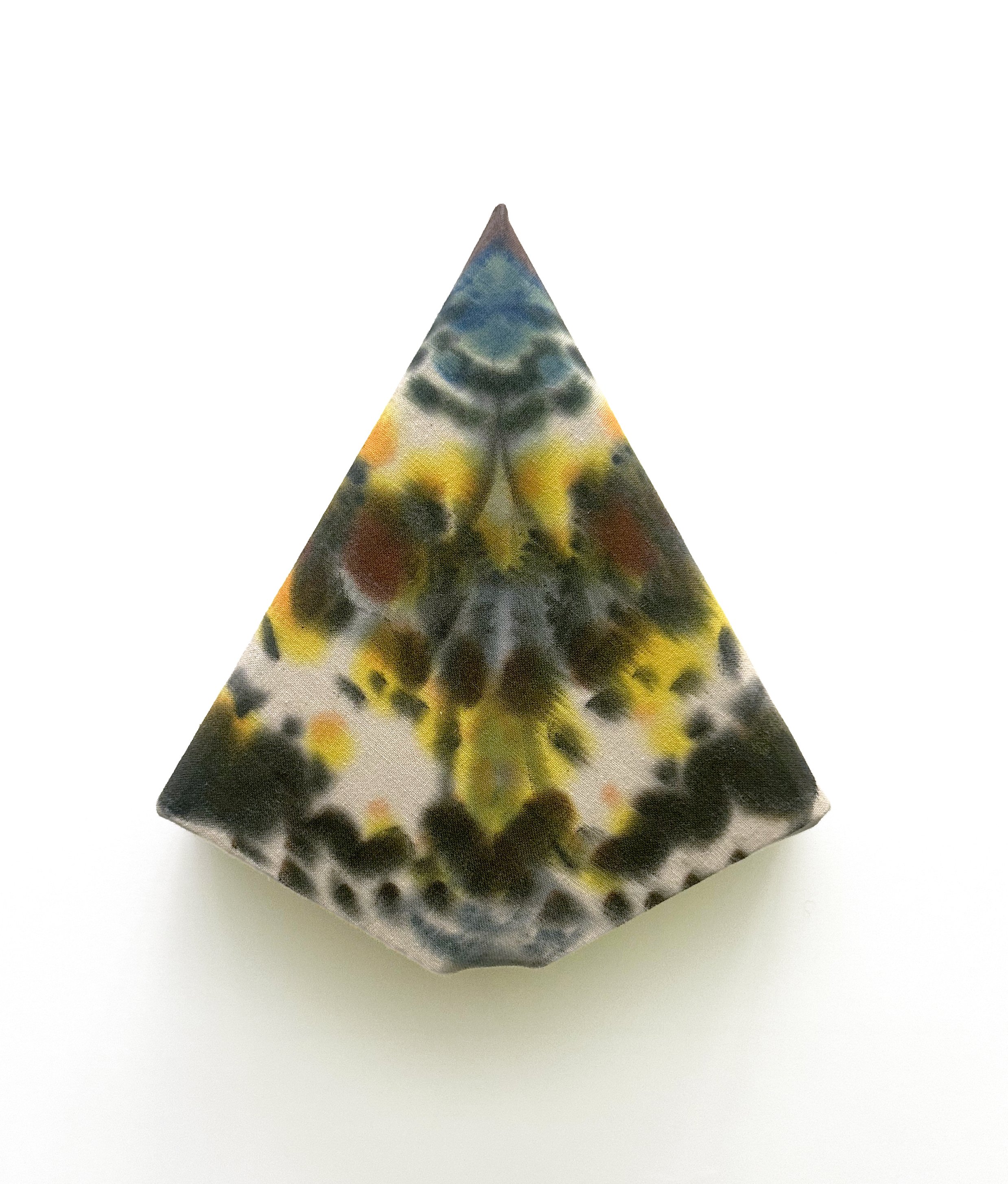
Ash Ferlito looks to nature for inspiration, and through color highlights sensory experience. In her shaped paintings, she derives form and color from specific moth species, such as the yellow, green, and black of the White Furman Moth presented here. As mostly nocturnal creatures, moths can be difficult to see, and are often assumed to be muted in hue. Ferlito helps us see that when closely viewed, many moths reveal patterns, textures, and even rich chroma.
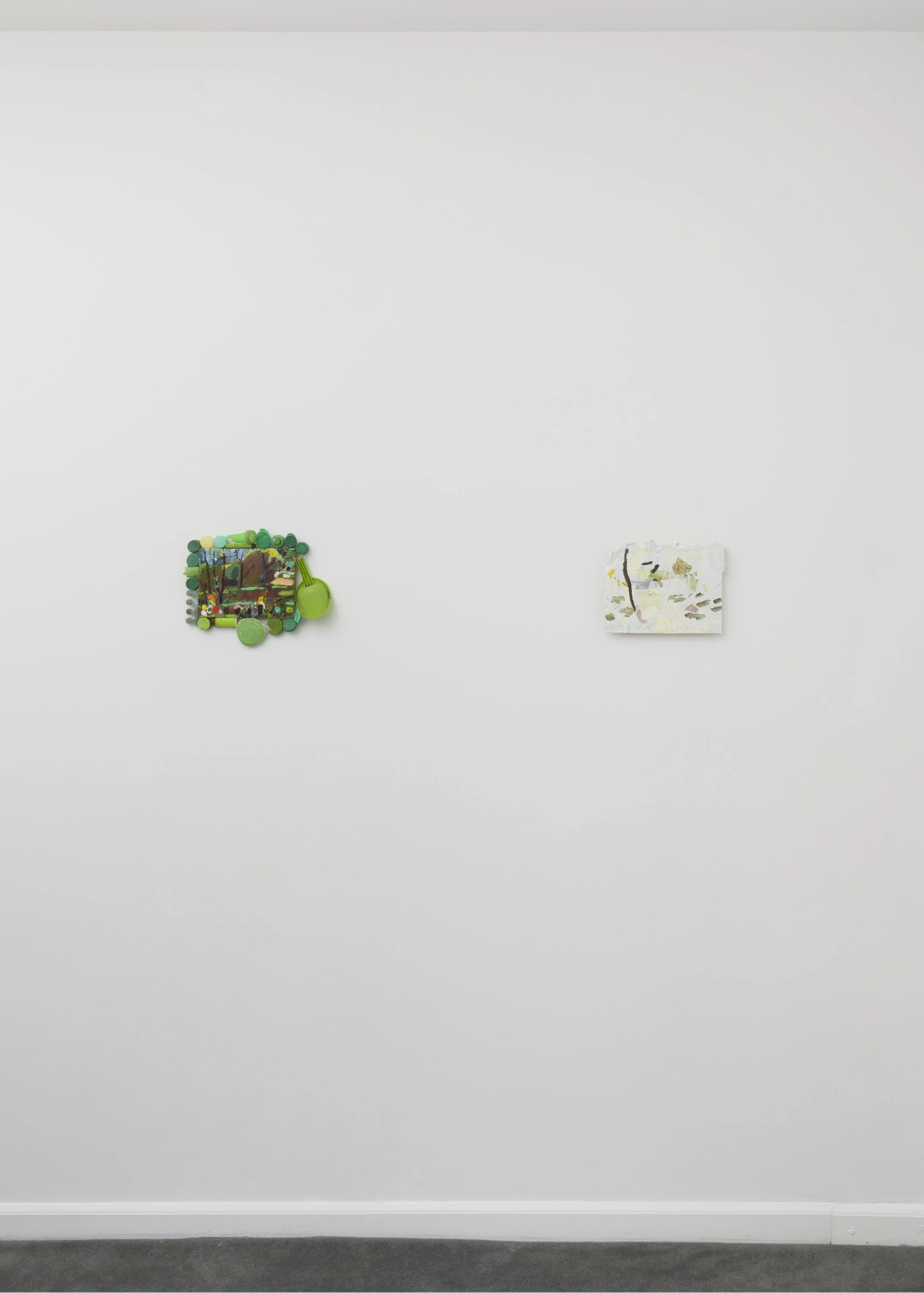
Stacy Fisher’s sculptural paintings reverse fact and fiction by blurring the distinction between background and foreground. Her visible brushwork and color choices are also guided by their functional properties and a desire to contrast highly saturated colors with neutral ones. The colors of her multi-part panels accentuate or camouflage areas where the surfaces shift. Color becomes an almost figurative one, with color blocks acting against one another in a charade.
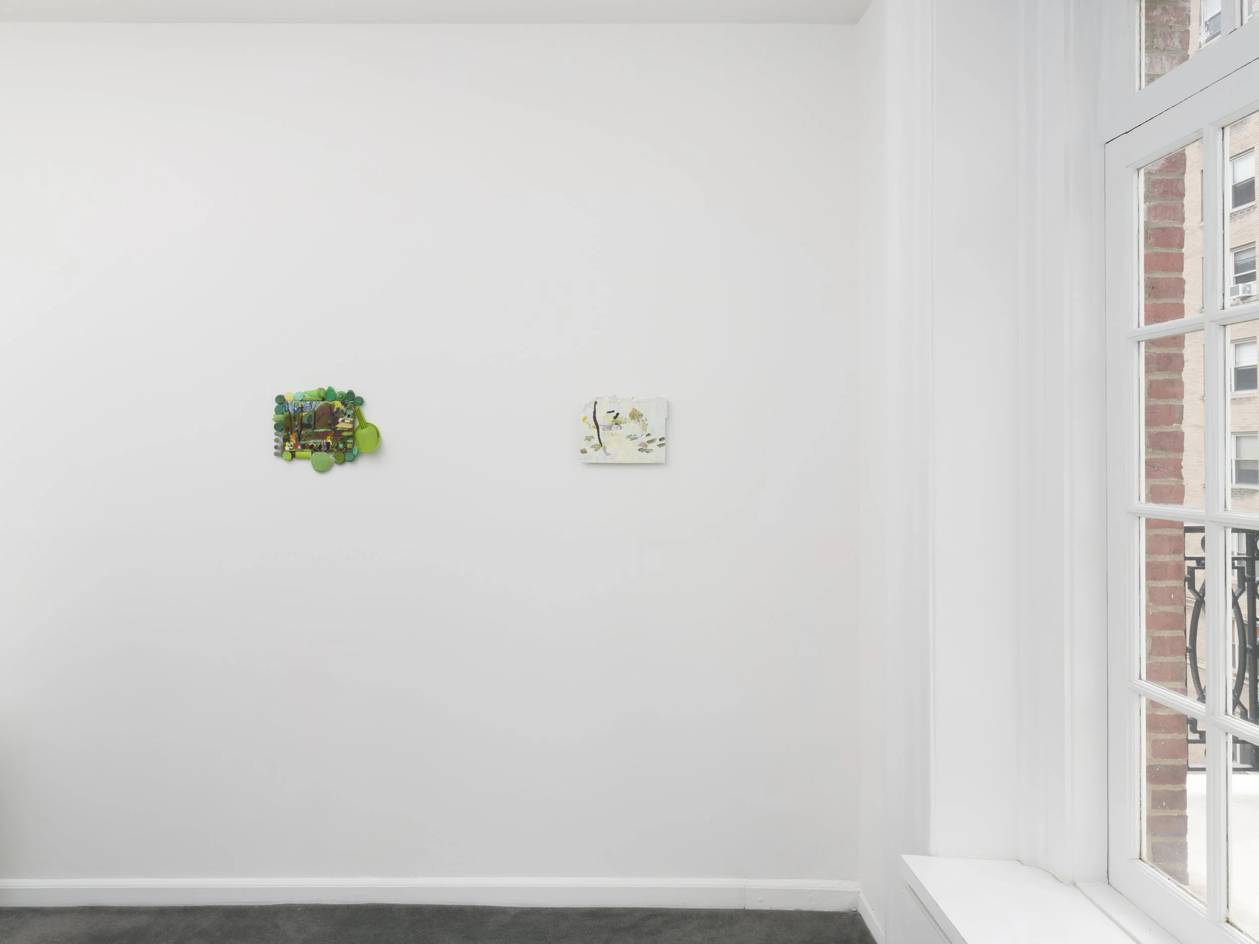
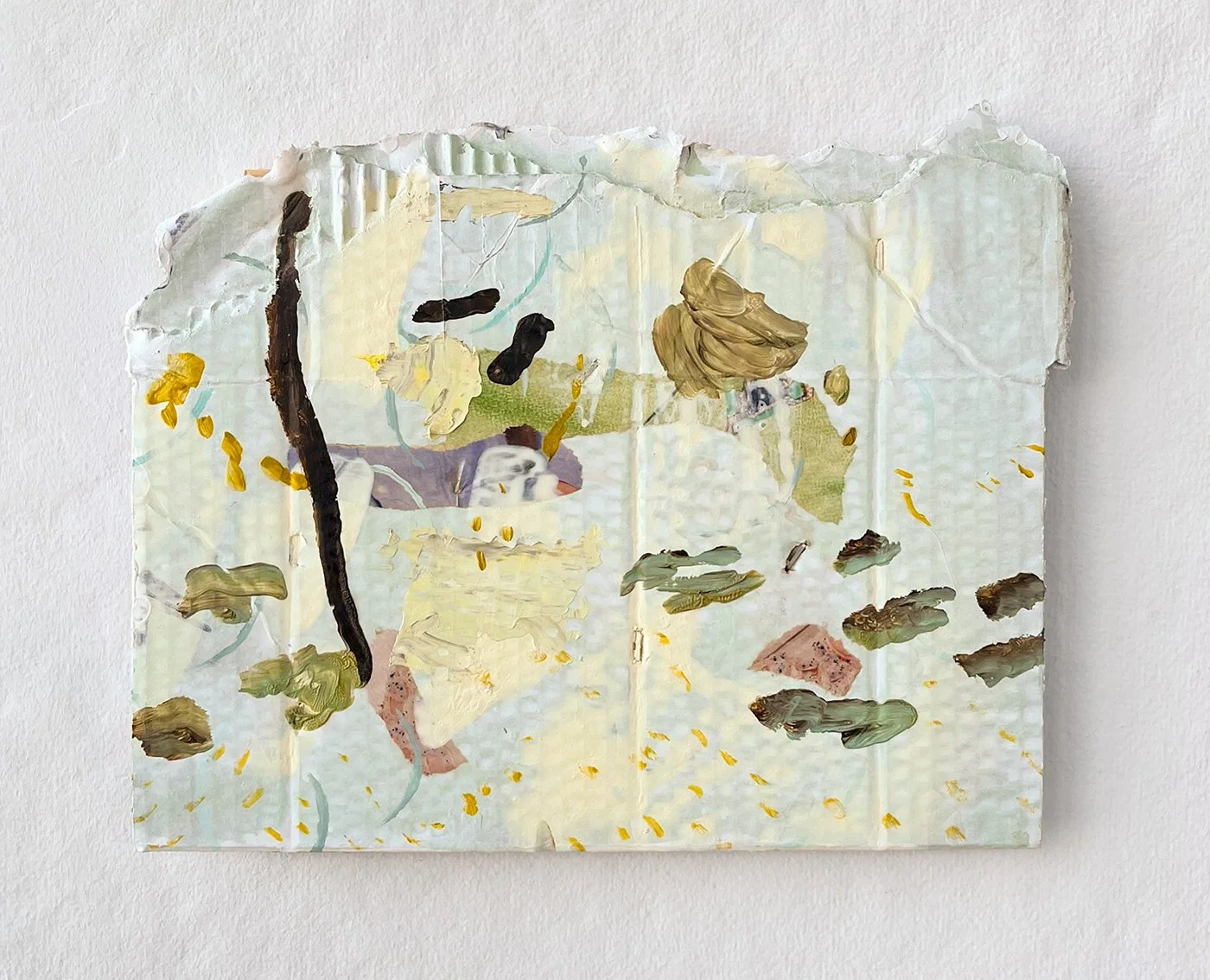
Kaitlin Zorah McDonough describes color as a set of highly specific frequencies which she uses as the guiding directional force throughout her painting process. Colors land for her with resounding clarity and specificity, resonating with the tone, qualities, and essence of each painting's subject. McDonough uses found substrates and integrates collage into her paintings, so that material and color become closely linked, tactile and felt, in works she describes as “etheric portraits.”
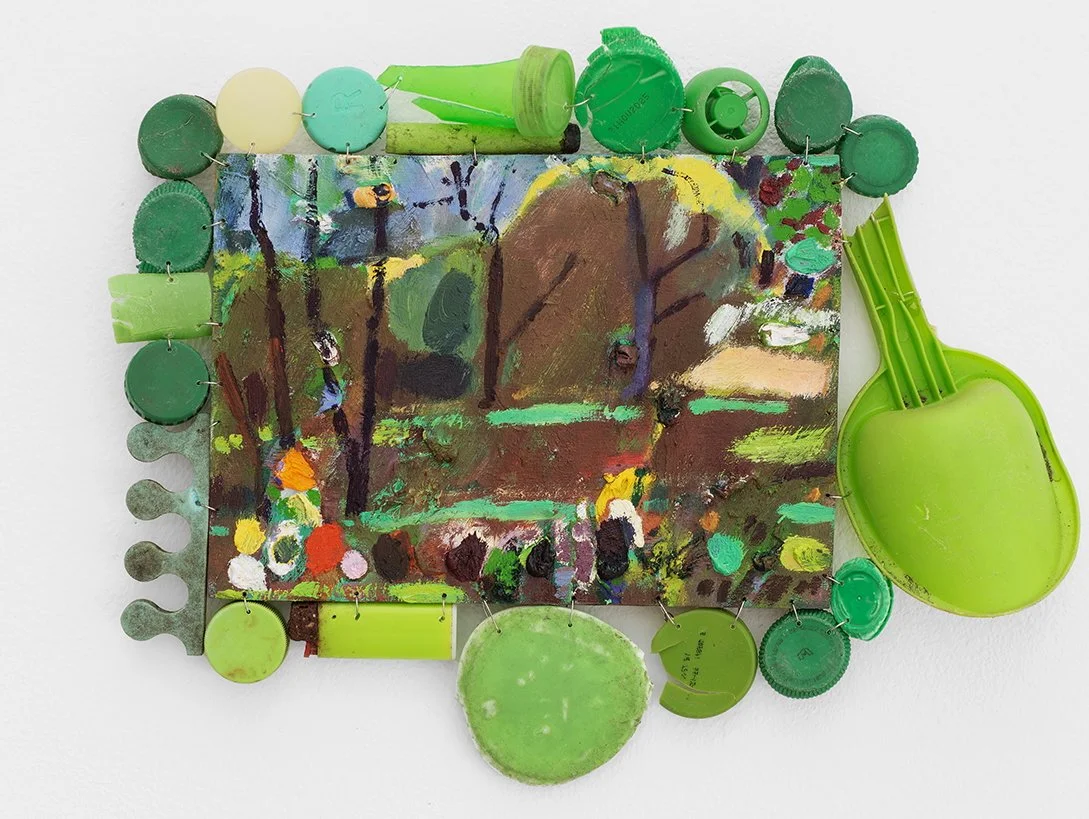
Ilse Sørensen Murdock paints in local parks and small pockets of urban nature. She collects plastic fragments from nearby shores and marshes and pairs them with plein air paintings made in those same places. The saturated colors of plastic packaging, designed to attract, shift in meaning once discarded and encountered in nature. By bringing these fragments together with her paintings, Murdock reconsiders and reactivates their color.
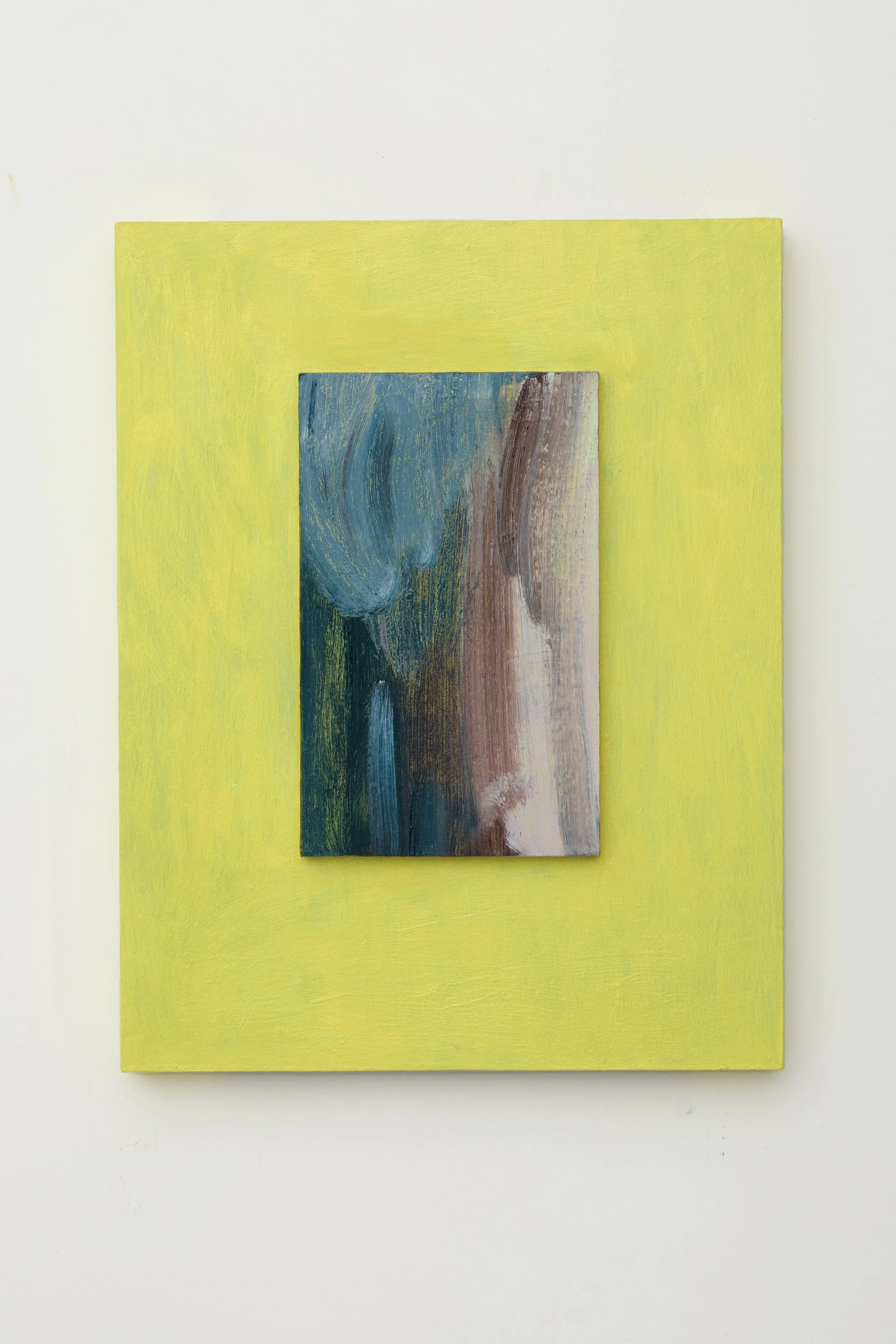
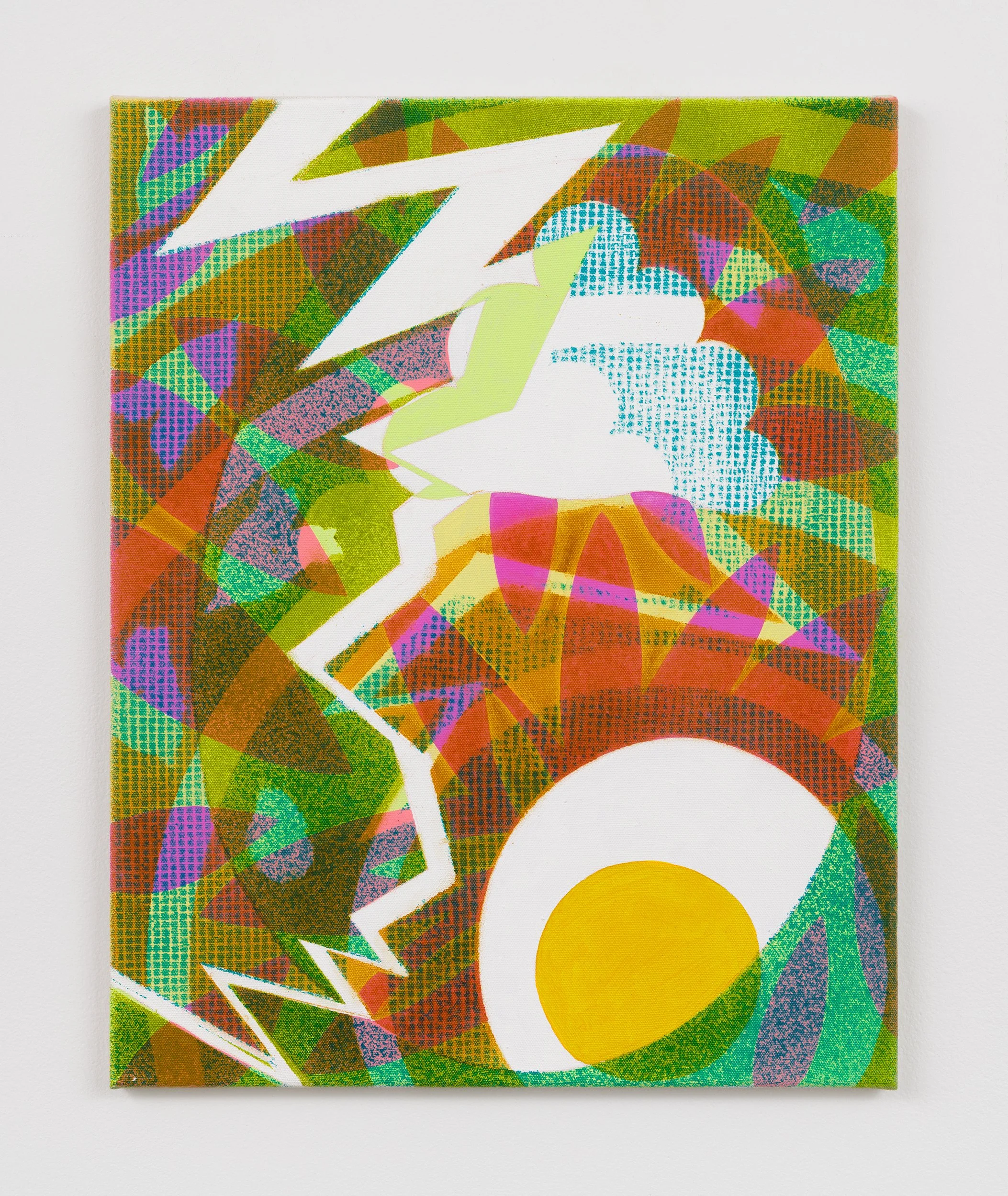
Maria Stabio integrates shape, pattern, and transparency into vibrant, graphic tableaux that suggest botanical or weather systems. Stabio’s relationship with color shifted upon leaving New York to visit family in the Philippines. There, she realized color was a default, obvious choice and an endless celebration of vitality. This dual sensibility, a collision of cultures, is imbued in the energy of her paintings, which integrate black and white alongside passages of high-chroma.